
Paralela Escola Olfativa
A Paralela é uma escola dedicada ao ensino, cultura, treinamento e experiências em perfumaria. Fomos procurados por eles para ajudar em um desafio: expressar visualmente seu novo posicionamento, através do redesenho da marca, identidade e desdobramentos gráficos e digitais. Após um processo de entendimento da marca, da categoria e dos concorrentes, criamos uma marca e uma identidade visual que traduziu a escola de uma forma poética, moderna e objetiva.
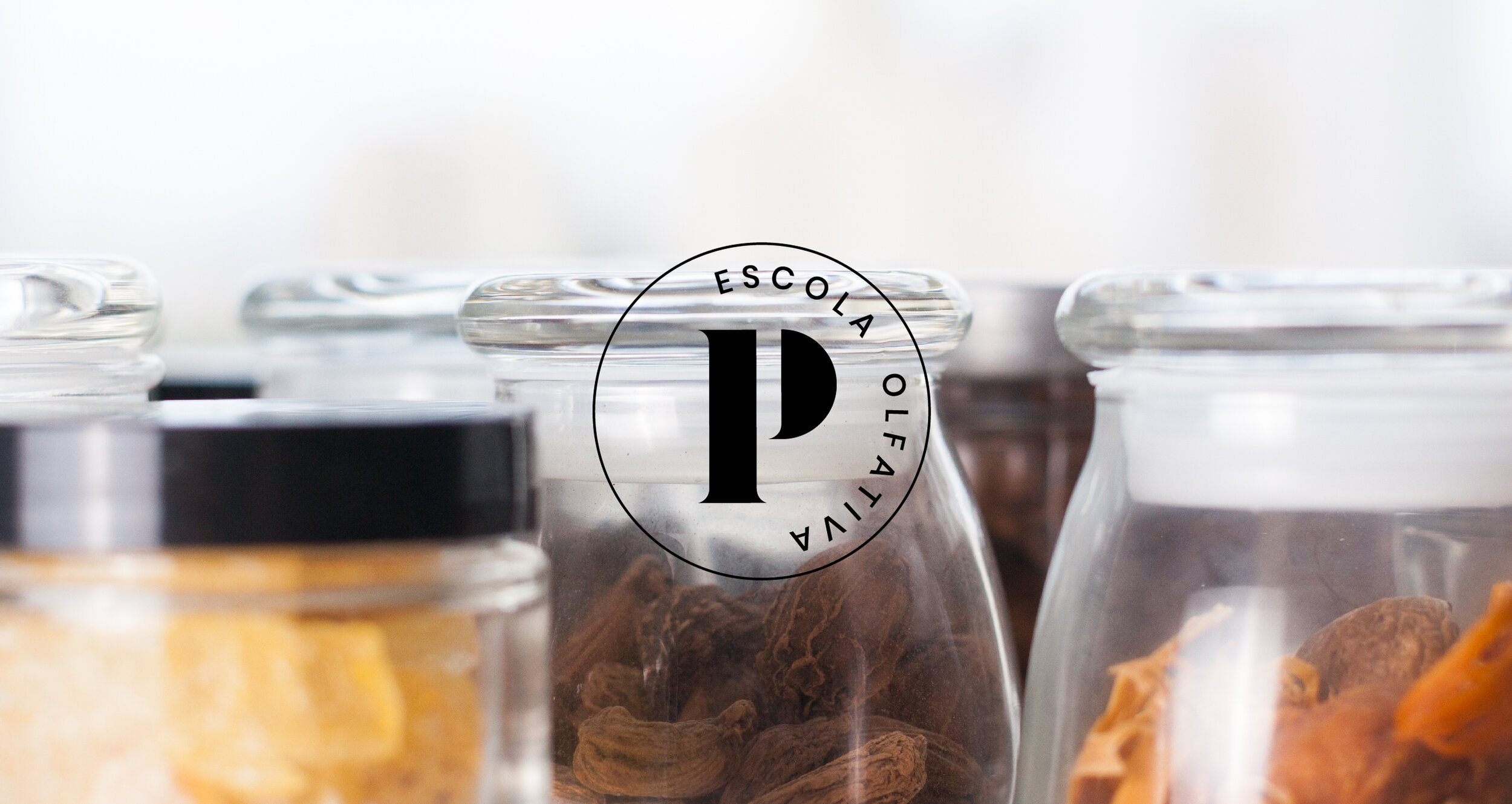
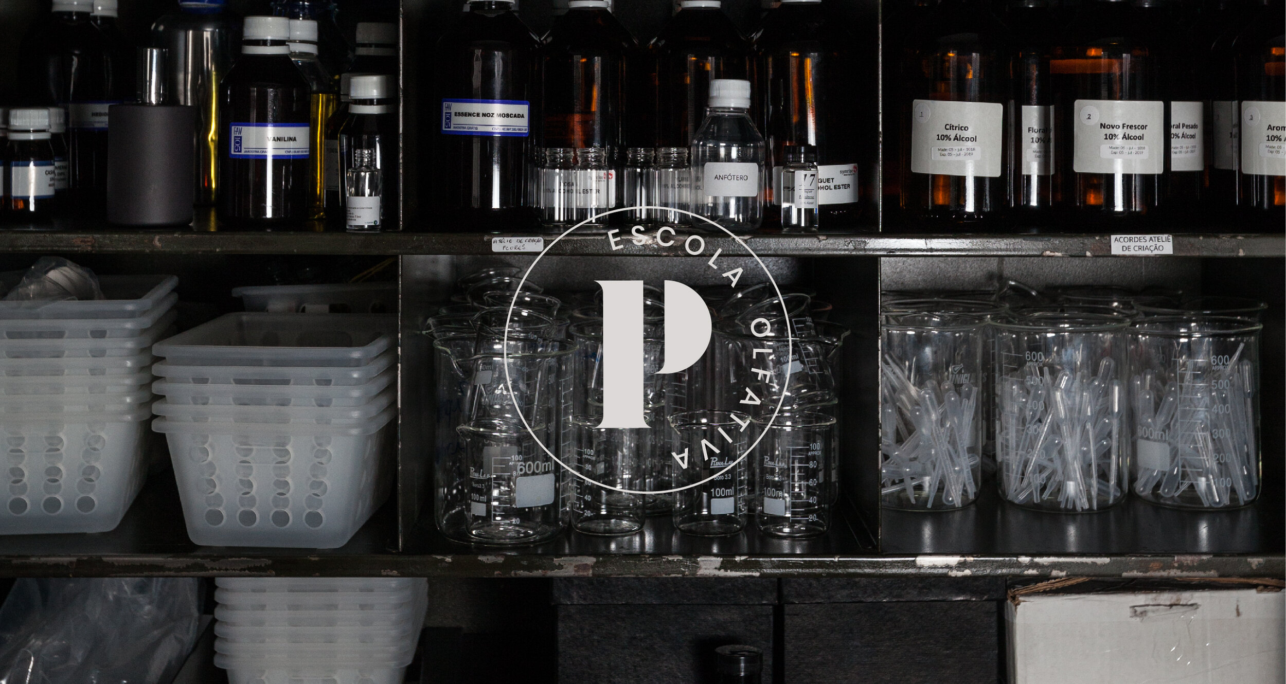
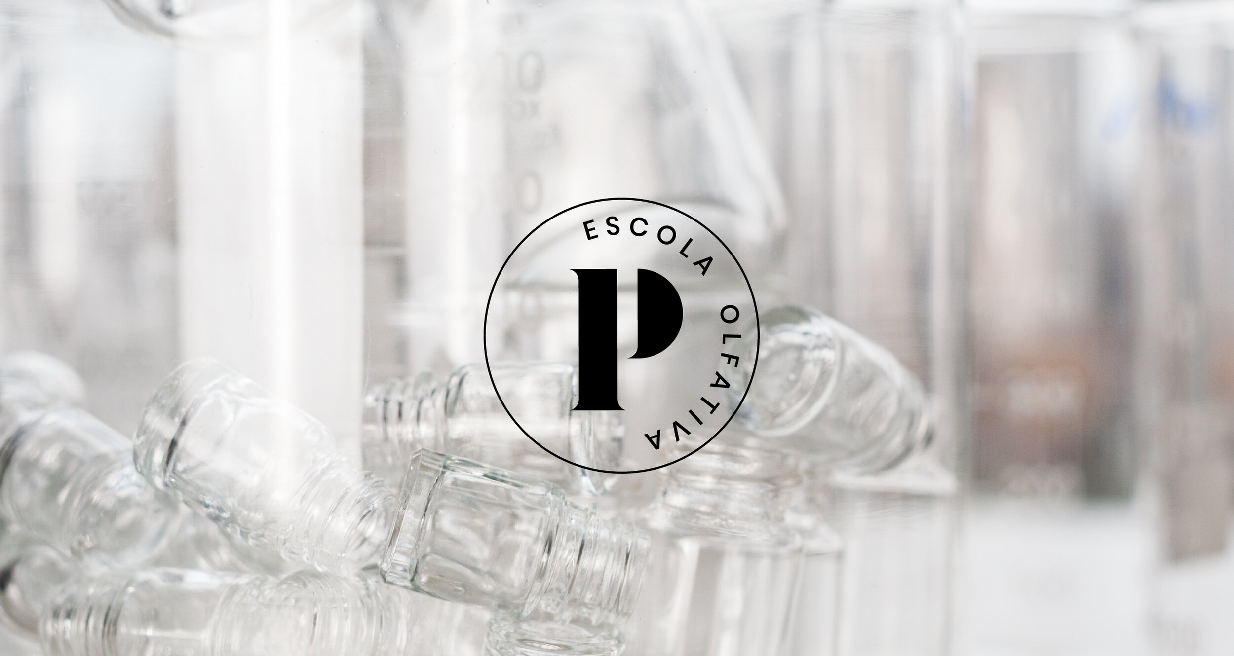
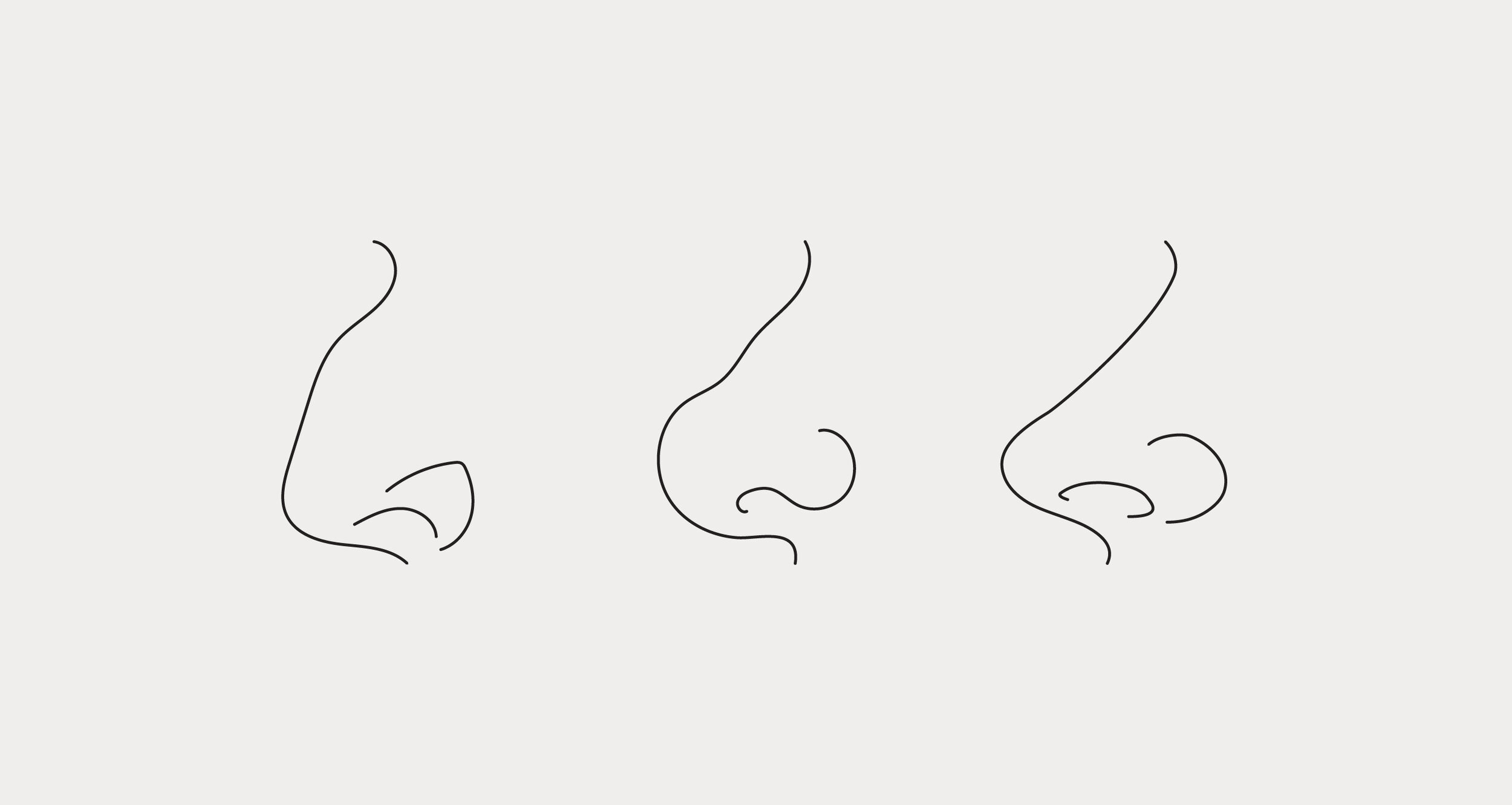
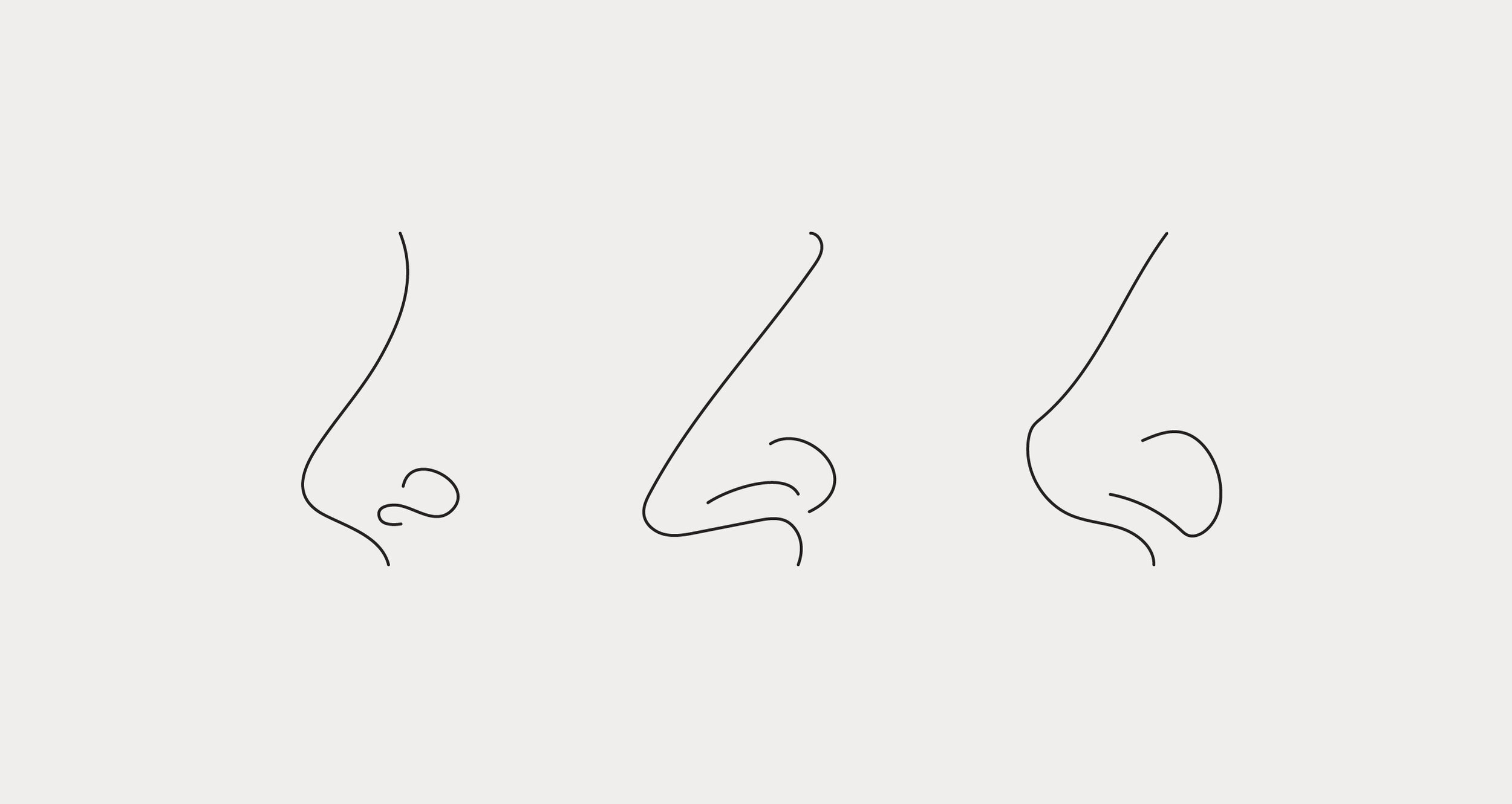
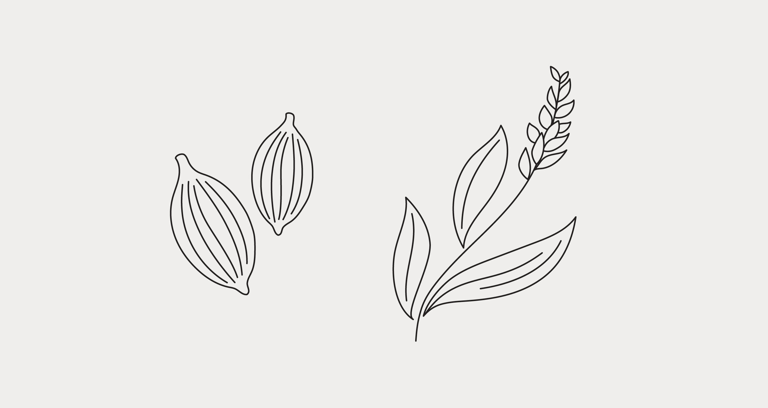
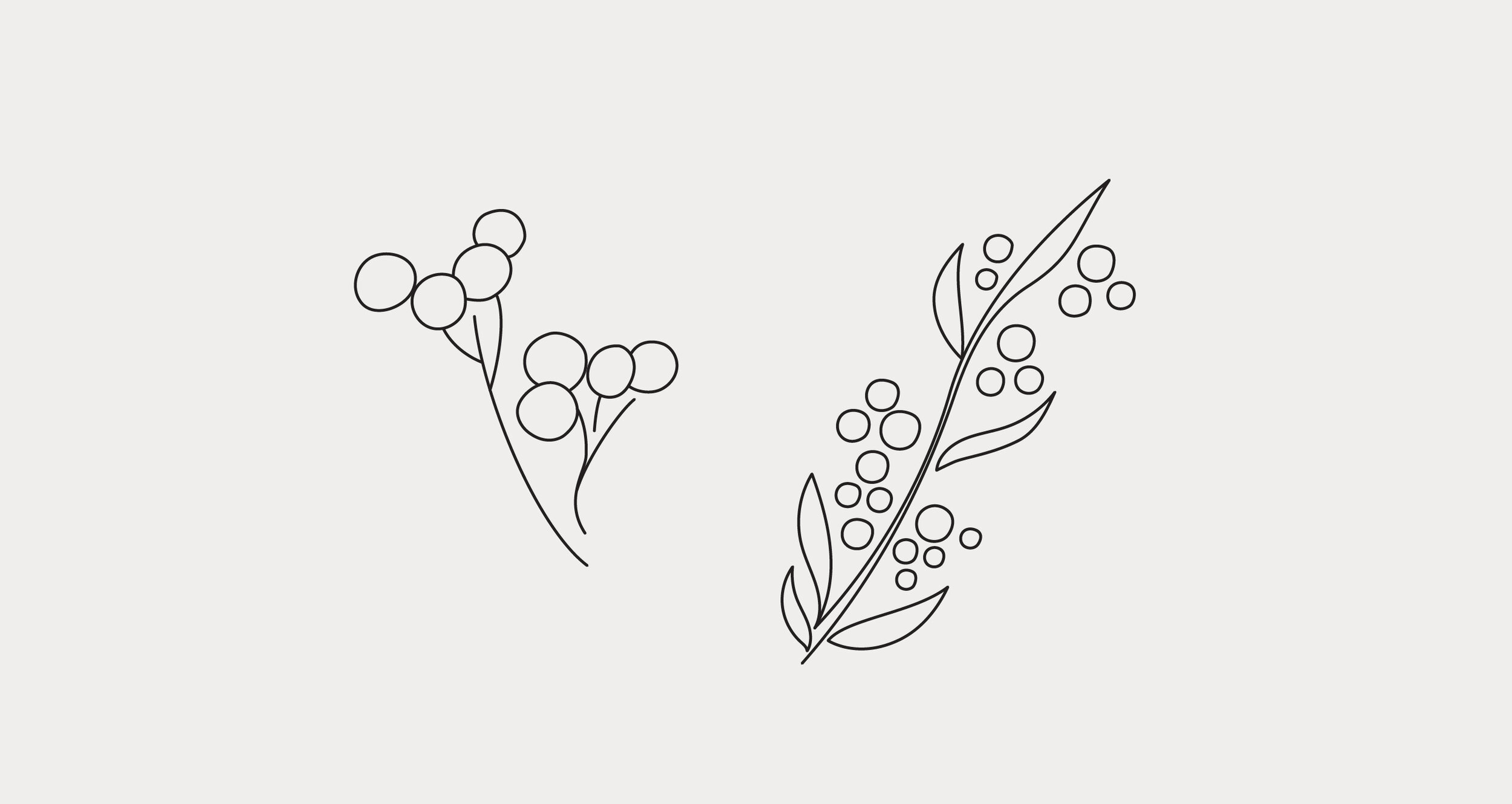
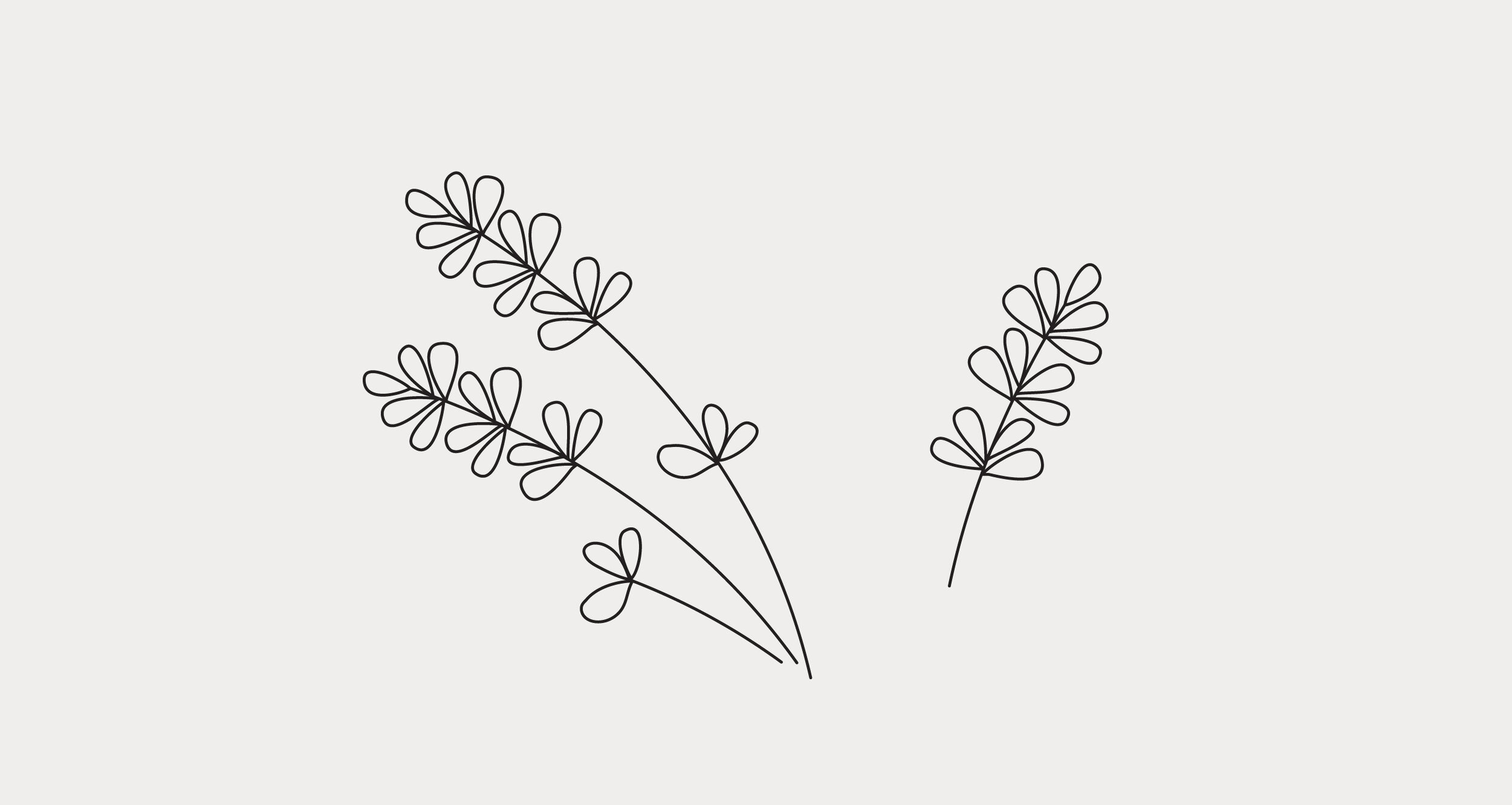
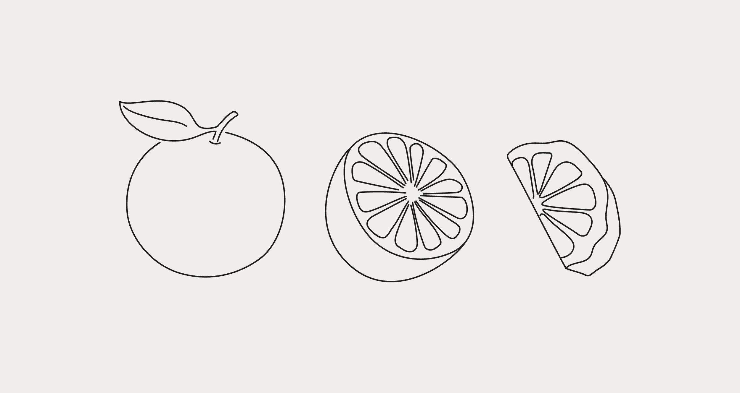
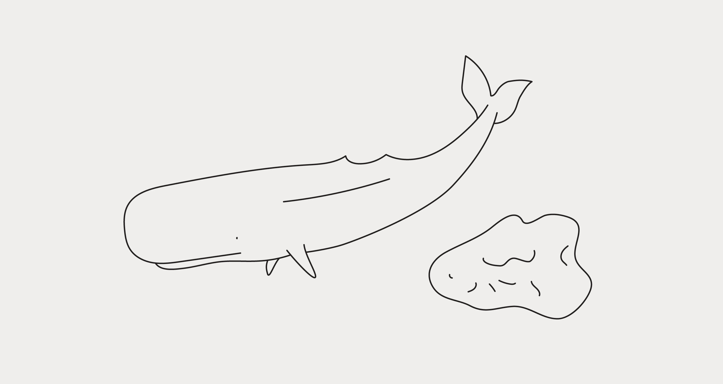
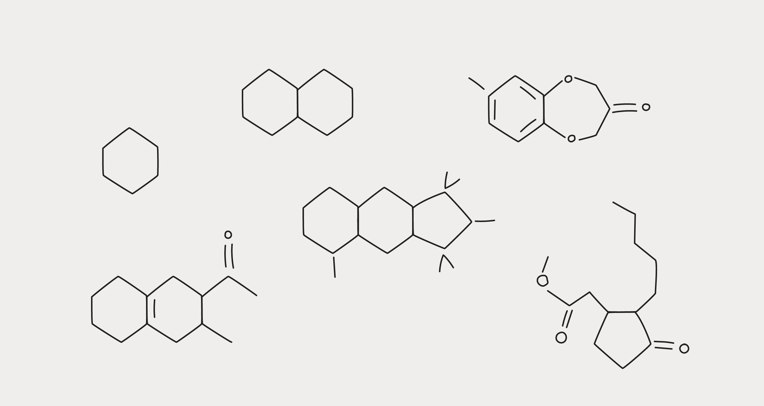
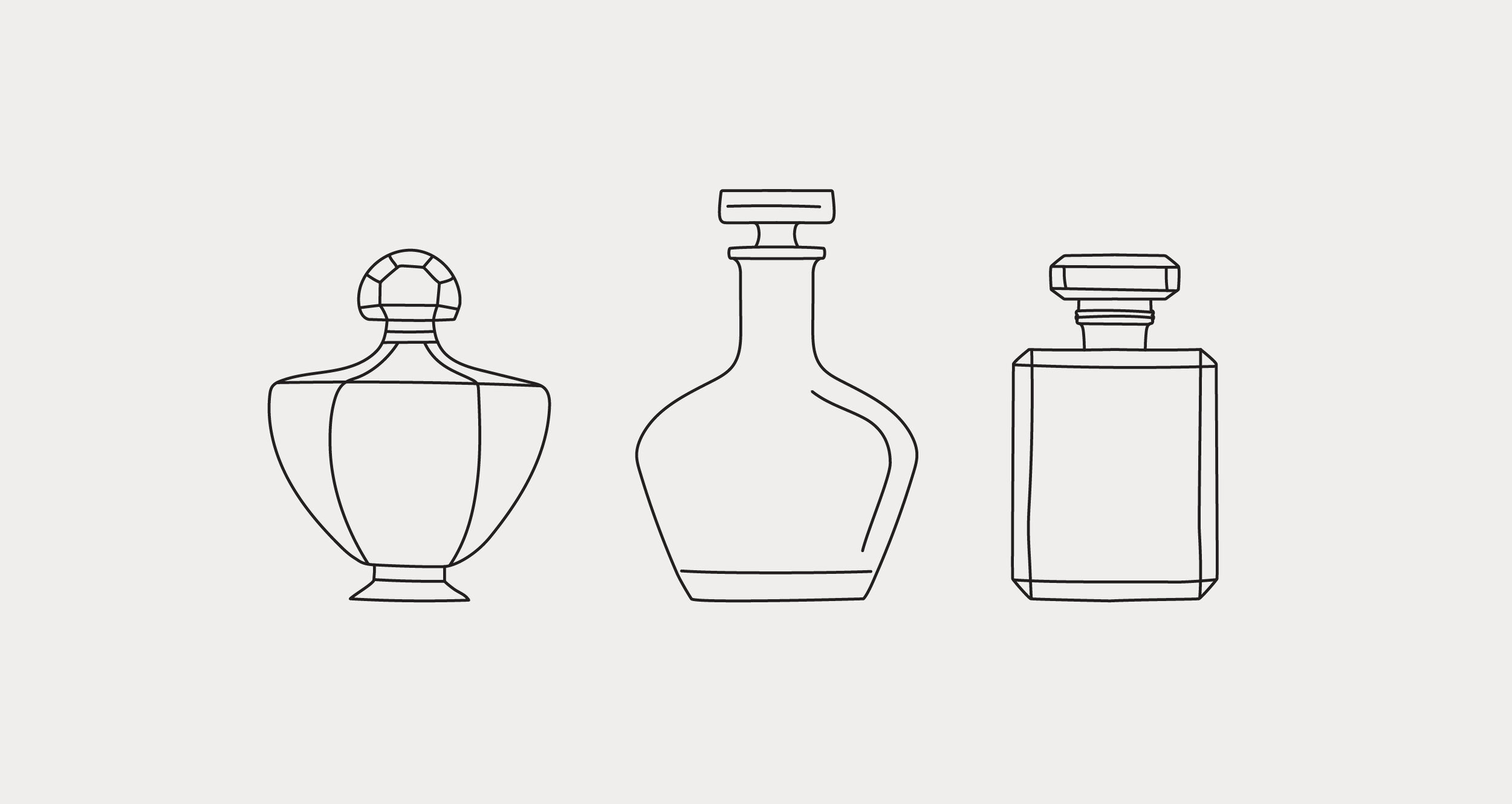
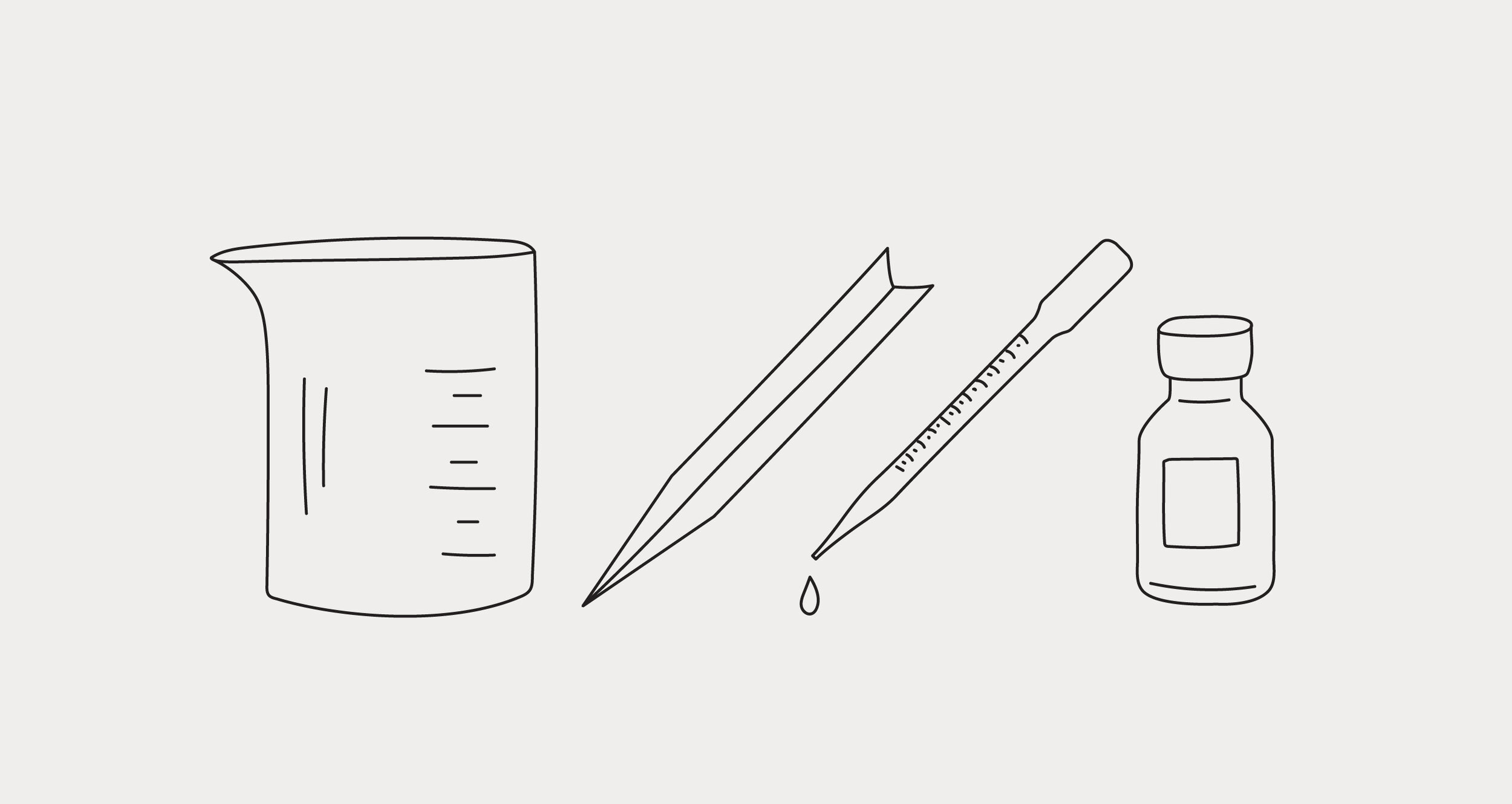
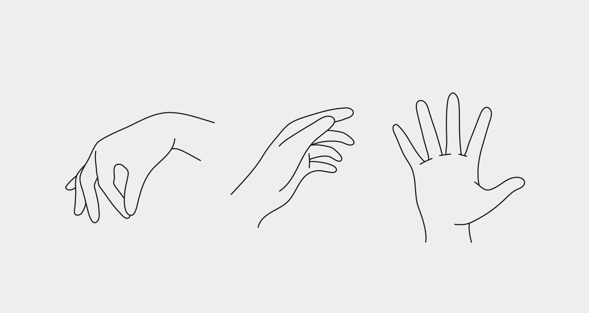
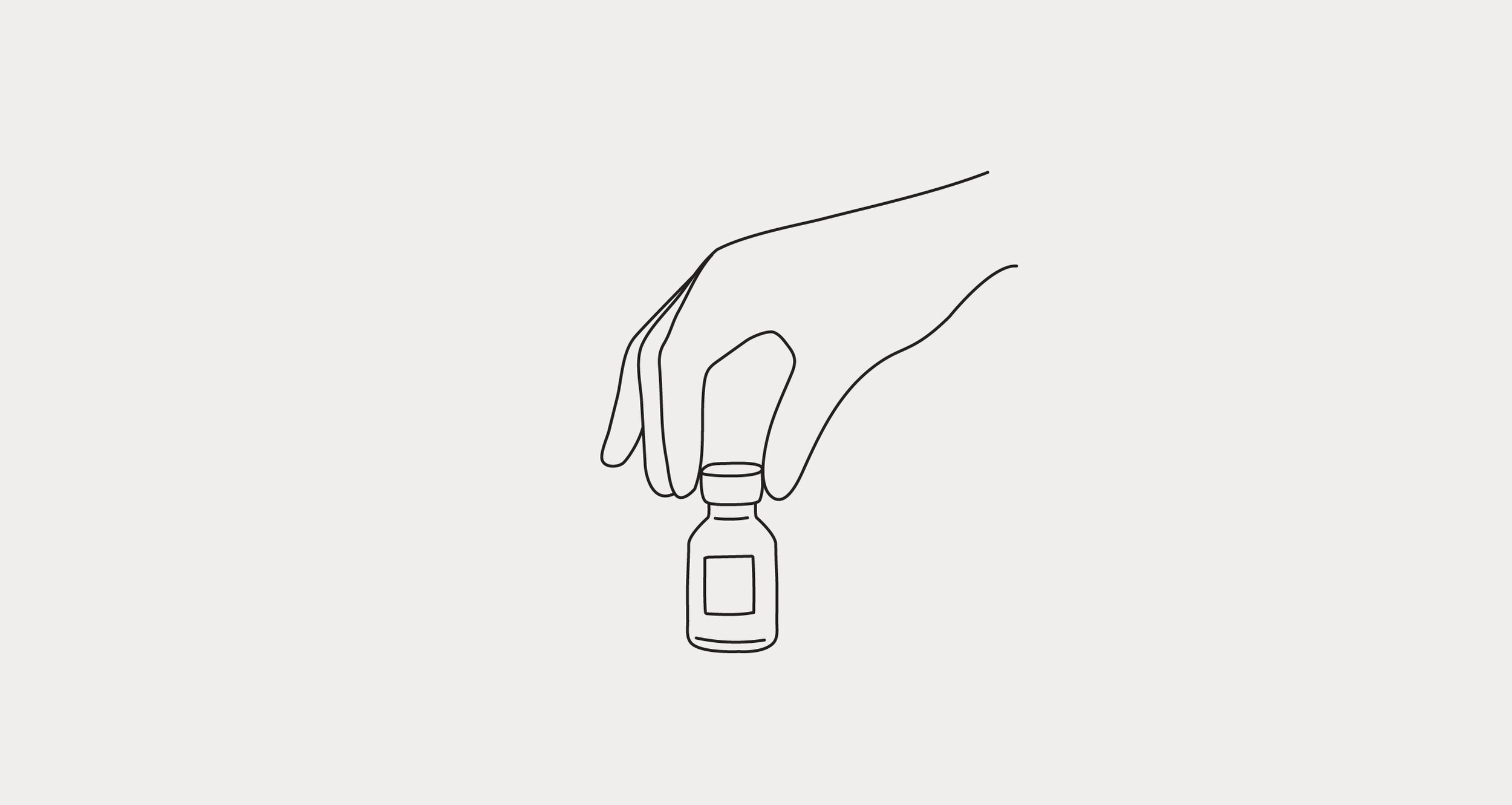
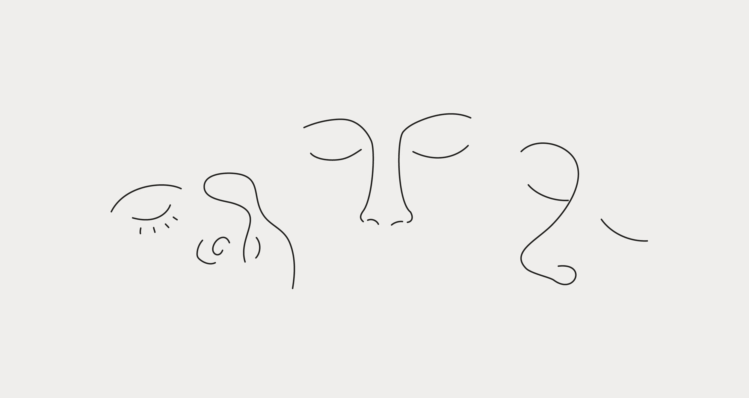
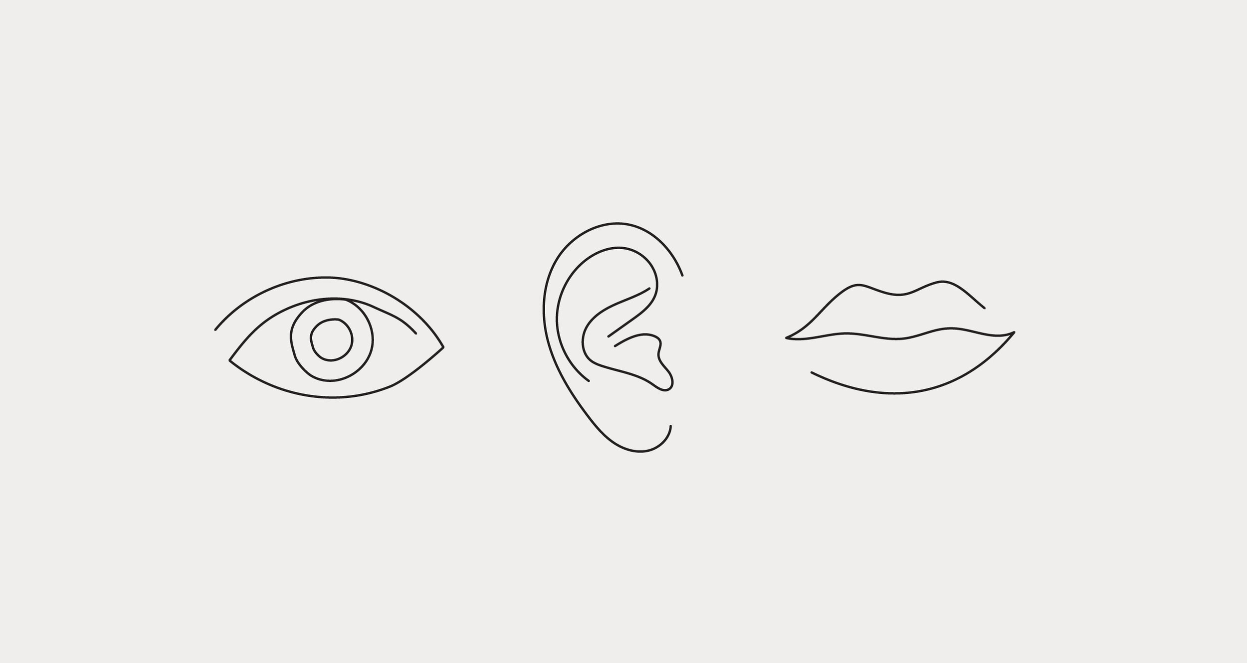
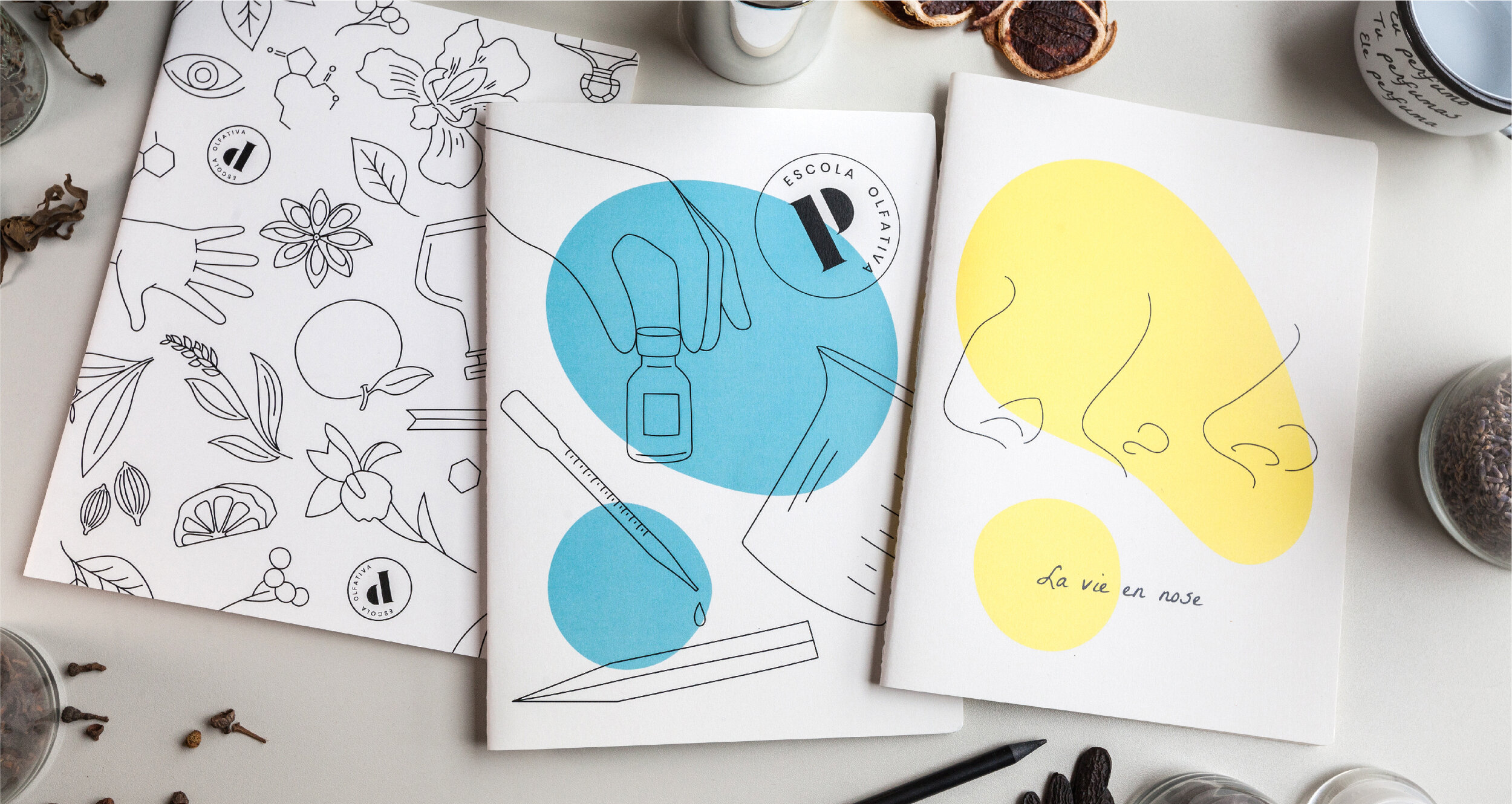
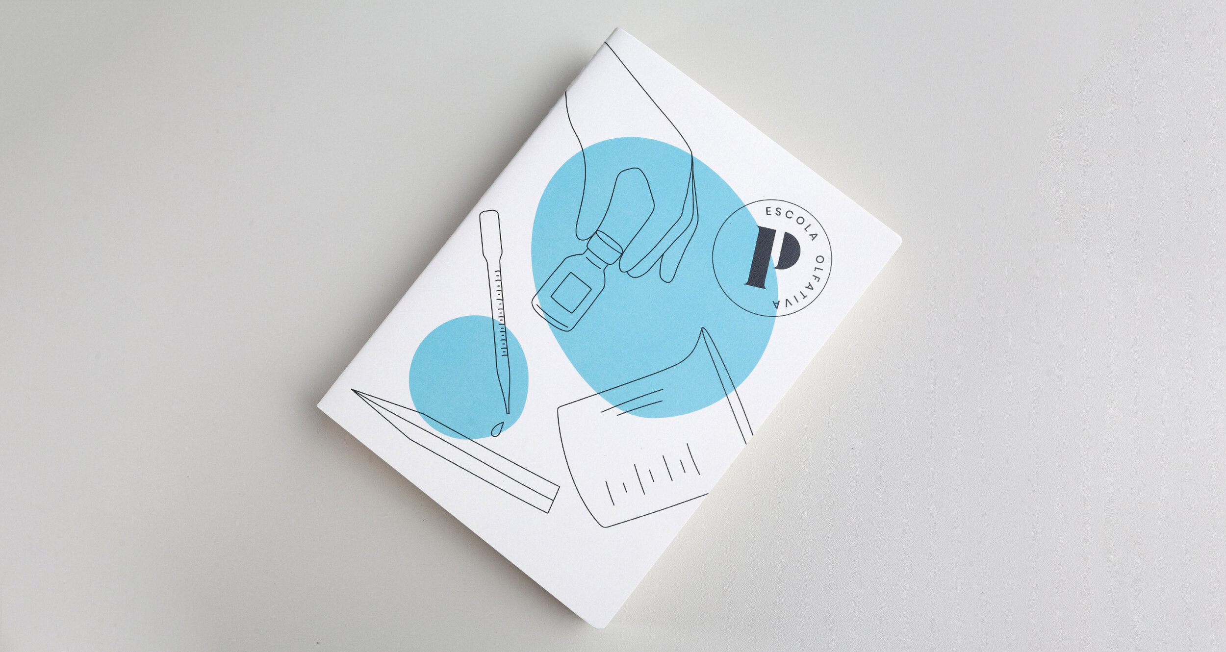
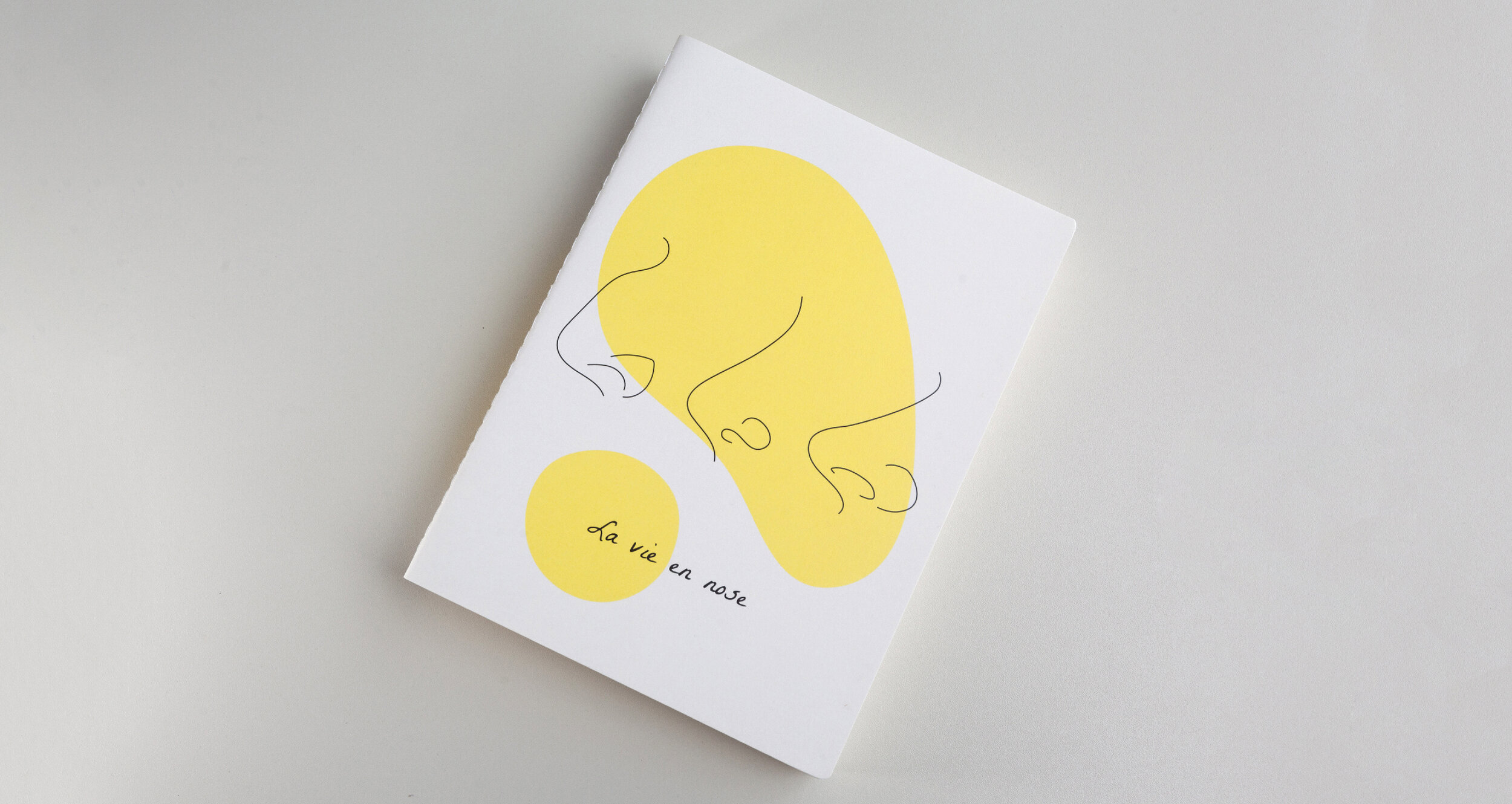
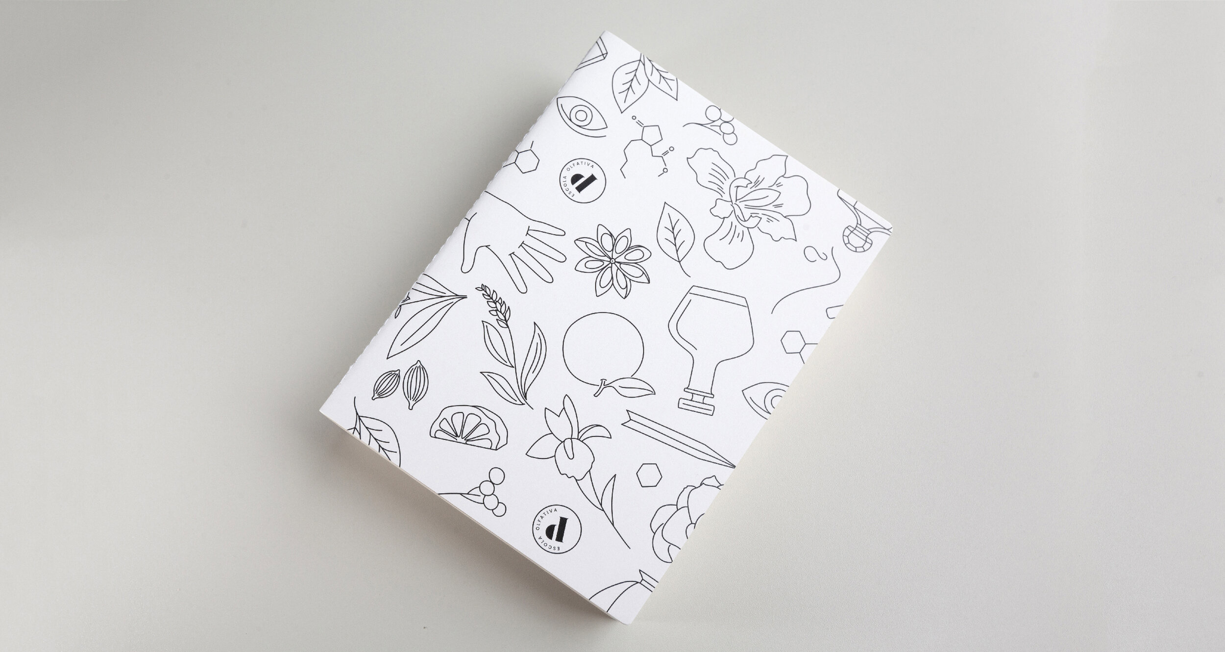
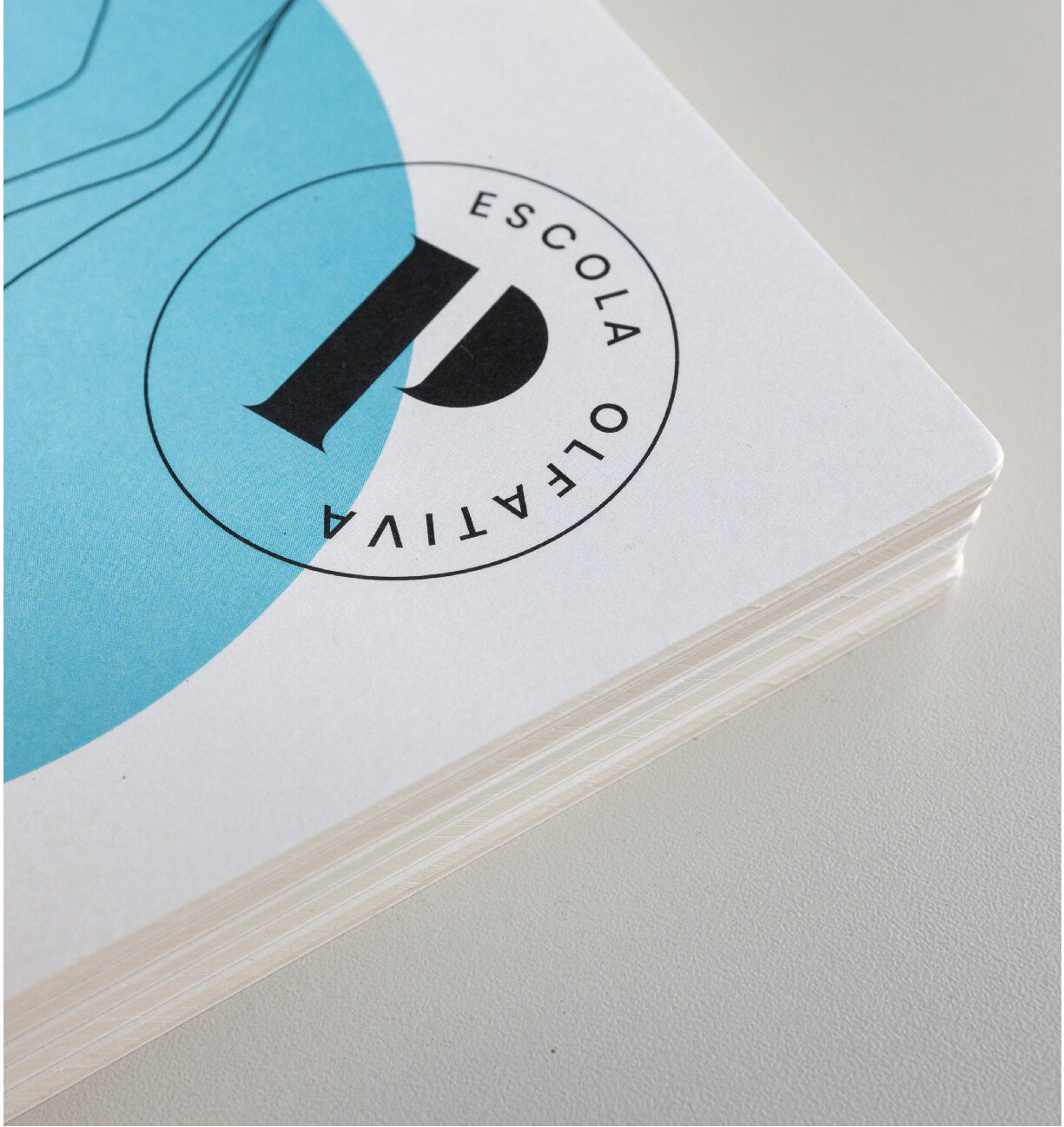
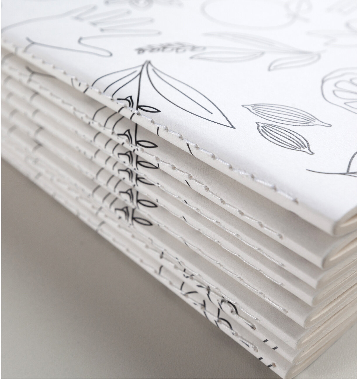
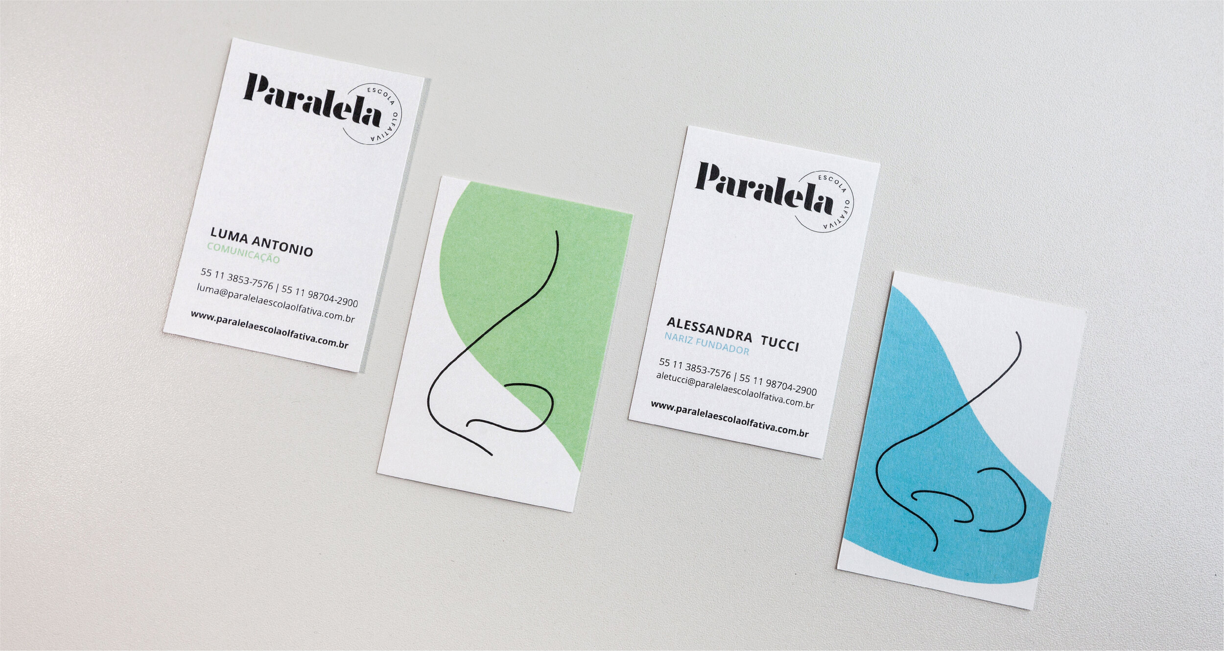
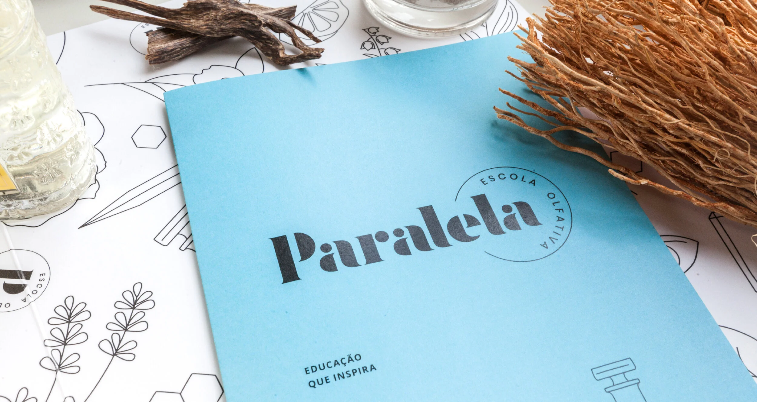
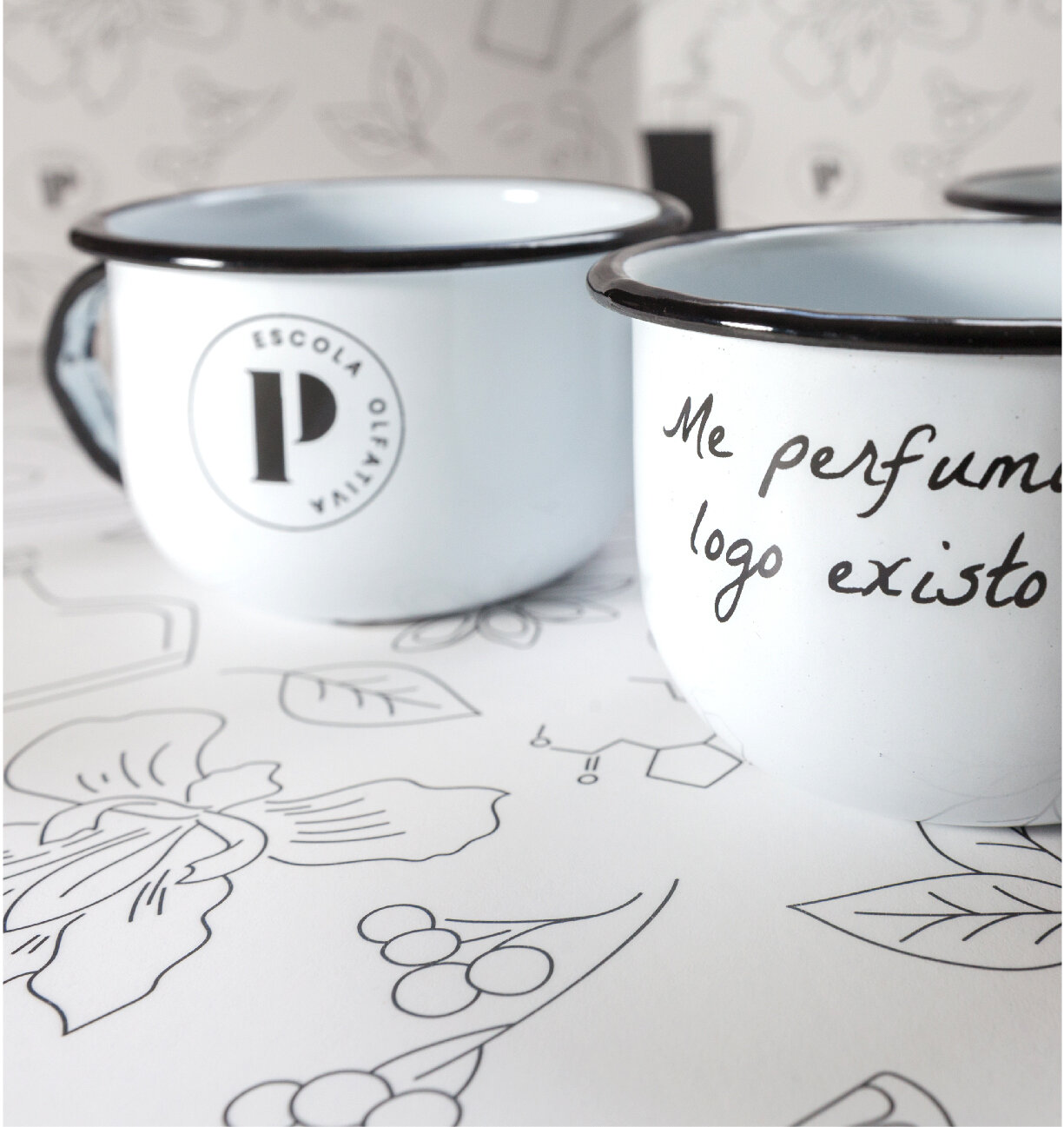
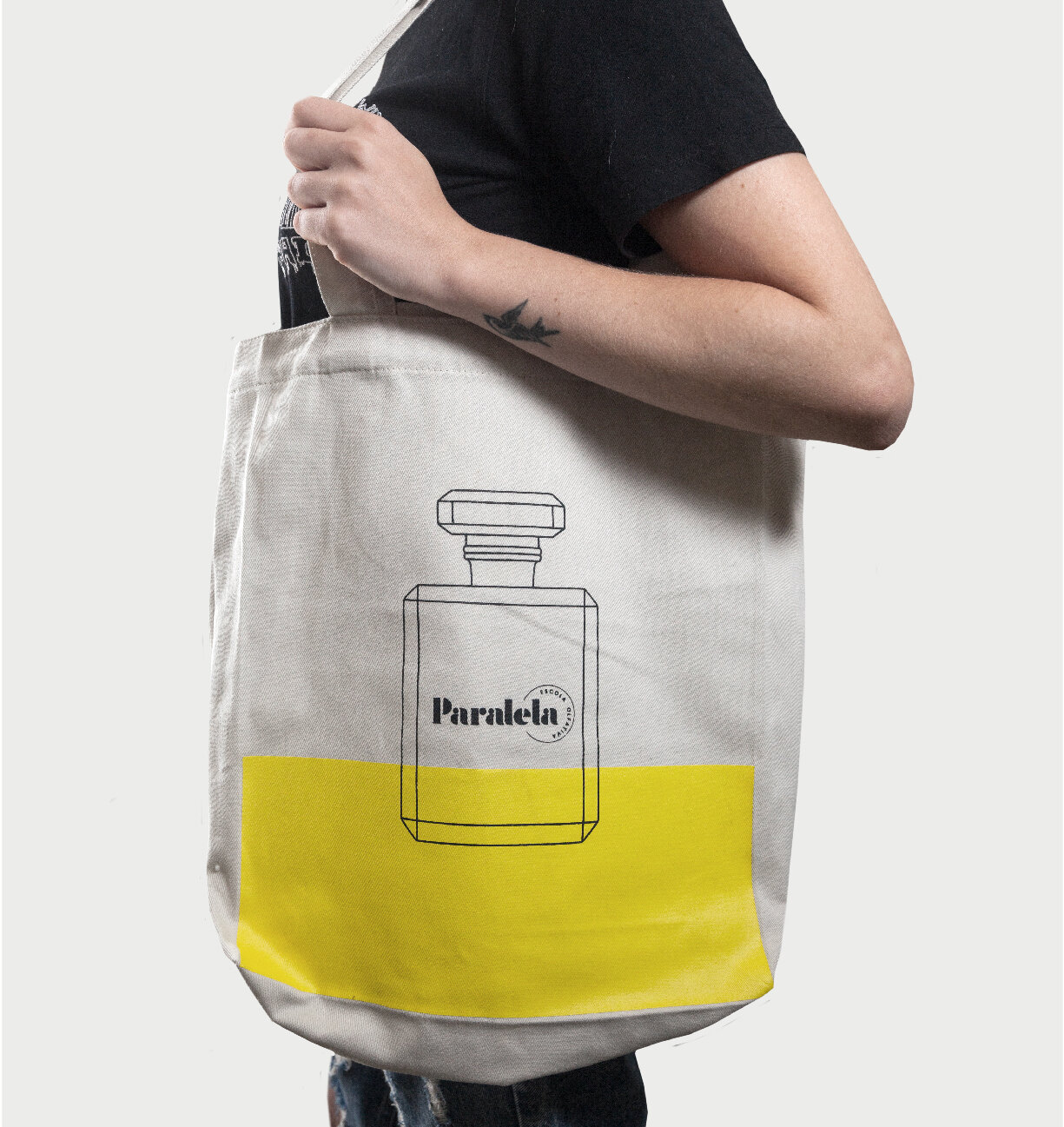
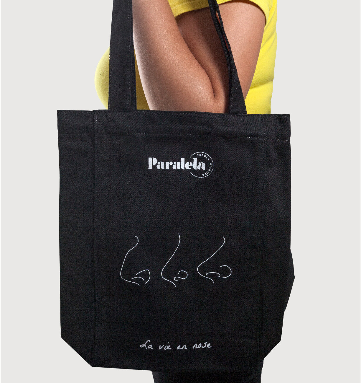
Para o logotipo, partimos de uma tipografia clássica e serifada, que remete ao universo da perfumaria parisiense. A fonte foi redesenhada para ganhar modernidade sem perder o charme original. A assinatura "escola olfativa" foi um desafio à parte, que resultou em sua aplicação em forma de círculo junto ao logotipo, trazendo movimento ao conjunto. Este recurso também ajudou a dar ainda mais charme ao sintetizarmos a marca em um selo, com a letra "P" circundada pela assinatura. A linguagem gráfica é composta por desenhos que ilustram os ingredientes, shapes coloridos que parecem se mover, e por linhas finas e sinuosas que representam os aromas. Um detalhe que gostamos bastante é que um dos narizes que fazem parte das ilustrações da identidade é o da Alessandra, fundadora da Paralela. Para os cartões de visita, continuamos com a brincadeira e desenhamos os narizes de todas as integrantes da Paralela.
O resultado final nos deixou orgulhosos, e com o sentimento de dever muito bem cumprido. Conseguimos criar uma identidade forte e memorável, mas ao mesmo tempo descomplicada e eficiente. Contemplamos assim um dos grandes desafios que tínhamos desde o início: desenvolver um sistema que permitisse que a Paralela pudesse criar internamente seus próprios materiais de apoio e divulgação.
Paralela is school dedicated the culture of perfumery. We were approached by them to help with a challenge: to visually express their new positioning, redesigning their brand and visual identity. After a process of understanding the brand, the category and their competitors, we created a brand and a visual identity that translated the school in a poetic, modern and objective way.
For the design of the logotype, we started from a classic serif typography, which refers to the universe of Parisian perfumery. The font was redesigned to gain modernity without losing its original charm. The signature "olfactory school" was a challenge in itself, which resulted in its application in a circle shape next to the logo, bringing movement to the design. This feature also helped to add even more charm by synthesizing the brand on a seal, with the letter "P" surrounded by the signature. The graphic language is composed of drawings that illustrate the ingredients, colorful shapes that seem to move, and thin and sinuous lines that represent the aromas. One detail that we really appreciate is that one of the noses that are part of the illustrations of the identity belongs to Alessandra, the founder of Paralela. For the business cards, we drew the noses of all the members of Paralela.
The final result made us proud, and with the feeling of a very well accomplished duty. We managed to create a strong and memorable identity, but at the same time uncomplicated and efficient. We thus contemplated one of the great challenges that we had since the beginning: to develop a system that would allow Paralela to create its own materials internally.