
Lopes
A Lopes é uma das marcas Brasileiras mais icônicas do ramo imobiliário. Ela está presente em 10 estados, tem em seu time cerca de 15.000 corretores e possui 180 mil imóveis a venda em seu sistema. Por isso ficamos muito felizes por termos sido escolhidos para ajudá-los a se reposicionar e redesenhar sua marca e identidade visual.
Nosso trabalho começou com uma fase de imersão e de aprendizado, onde entrevistamos várias pessoas e fizemos alguns focus groups para descobrir a imagem da marca. Este trabalho culminou com a proposta de um novo posicionamento para a Lopes. Chegamos à conclusão de que eles facilitam encontros. No final das contas são duas pessoas, ou dois corações, que se juntam para fazer uma transação.
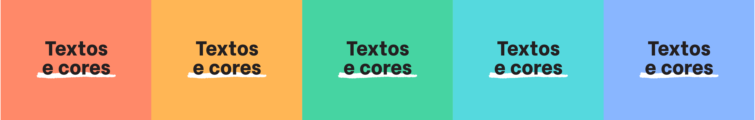
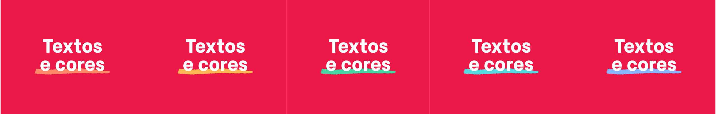
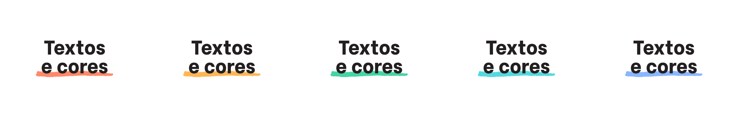
Com o novo posicionamento definido, veio a fase do redesenho da marca e da identidade. Começamos propondo um sutil redesenho do símbolo do coração. Suavizamos as suas curvas, e fizemos ele ter a forma de um coração amigável e contemporâneo. Para o logotipo, usamos letras em caixa alta e baixa, porque esta combinação traz proximidade e leveza. O logotipo será em vermelho como o símbolo. Desta forma, teremos uma marca monocromática, que é mais moderna e de mais fácil aplicação. Partindo da nova marca, redesenhamos e simplificamos todo o sistema de submarcas. Agora todas elas compartlilham a mesma cor, fonte e símbolo. Para os textos, adotamos duas famílias tipográficas, sendo que uma delas é proprietária. A fonte Lopes Sans foi customizada pelo designer Diego Maldonado à partir da Google Font ‘Be Vietnam’, especialmente para a marca. Além disso, incluímos o símbolo e as versões da marca dentro da fonte Lopes Sans. Assim, quando você digita por exemplo [lopes coração] no teclado, o símbolo aparece. Desta forma, garantimos que todos que possuam a fonte automaticamente tenham acesso aos arquivos da marca. Criamos também uma paleta de cores complementares alegres e vivas, que funcionam muito bem com o vermelho Lopes. O estilo das ilustrações e dos grafismos segue o mesmo traço da tipografia secundária Born Ready, que é manuscrita, criando uma expressão gestual, humana e proprietária. O resultado final nos deixou muito felizes, pois expressa de uma maneira muito clara o novo momento da marca Lopes.
Lopes is one of the most iconic Brazilian brands in the real estate industry. It is present in 10 states, has around 15,000 brokers on its team and has 180,000 properties for sale in its system. That is why we are very happy to have been chosen to help them reposition themselves and redesign their brand and visual identity.
Our work started with an immersion and learning phase, where we interviewed several people and made some focus groups to discover the brand image. This work culminated with the proposal of a new positioning for Lopes. We have come to the conclusion that they facilitate meetings. Ultimately it is two people, or two hearts, who come together to make a transaction.
With the new positioning defined, the brand and identity redesign phase came. We began by proposing a subtle redesign of the heart symbol. We softened his curves, and made it have the shape of a friendly and contemporary heart. For the logo, we used upper and lower case letters, because combination brings proximity and lightness. The logo will be in red as the symbol. In this way, we will have a monochromatic brand, which is more modern and easier to use. Starting from the new brand, we redesigned and simplified the entire sub-brand system. Now they all share the same color, font and symbol. For the texts, we adopted two typographic families, one of which is proprietary. The Lopes Sans font was customized by designer Diego Maldonado from the Google Font ‘Be Vietnam’, especially for the brand. In addition, we have included the symbol and versions of the brand within the Lopes Sans font. So, when you type for example [lopes heart] on the keyboard, the symbol appears. In this way, we guarantee that everyone who has the font automatically has access to the brand's files. We have also created a palette of cheerful and lively complementary colors, which work very well with the Lopes red. The style of the illustrations and graphics follows the same style of the secondary typography Born Ready, which is handwritten, creating a gestual, human and proprietary expression. The final result made us very happy, because it expresses in a very clear way the new moment of the Lopes brand.