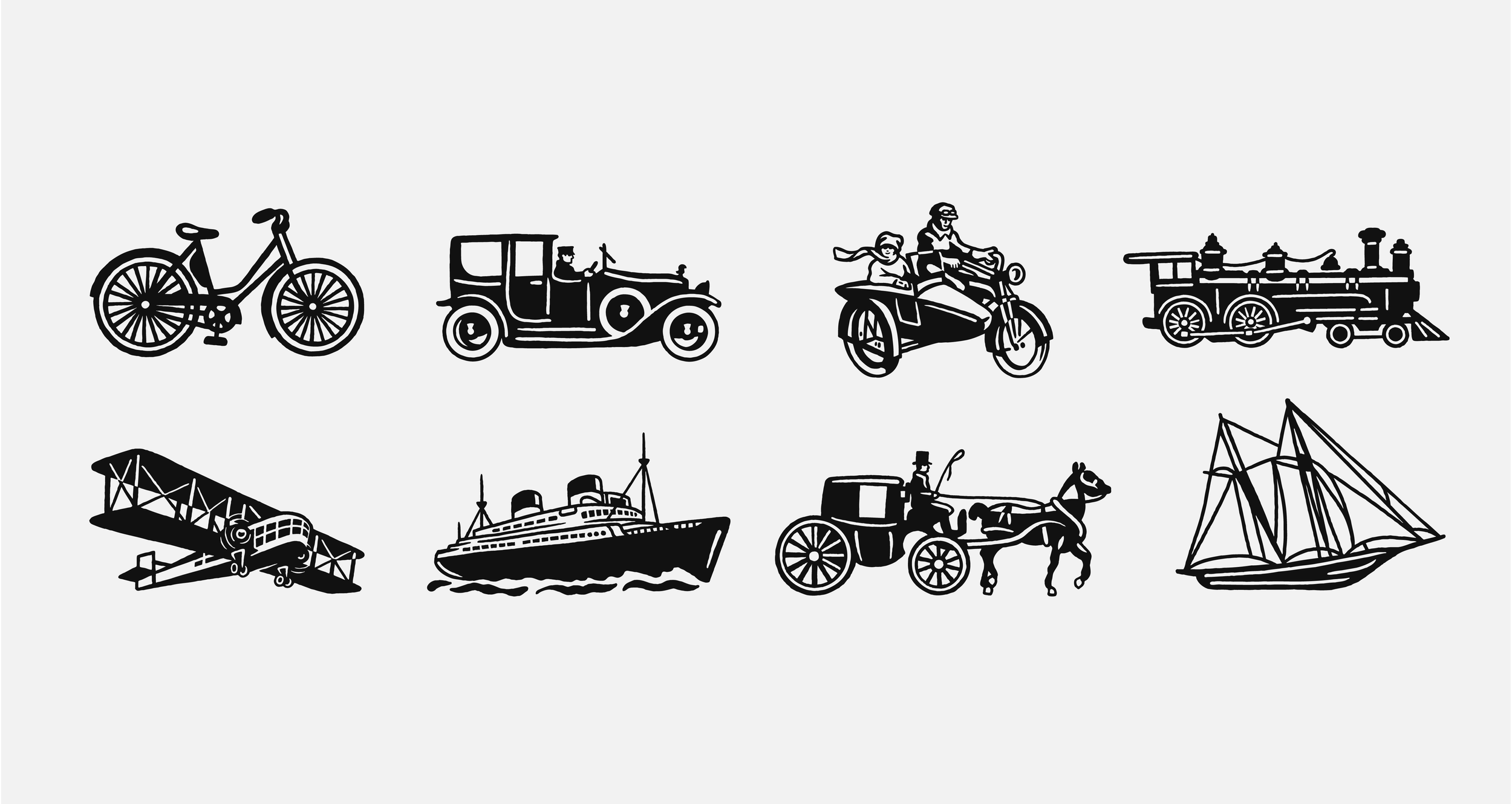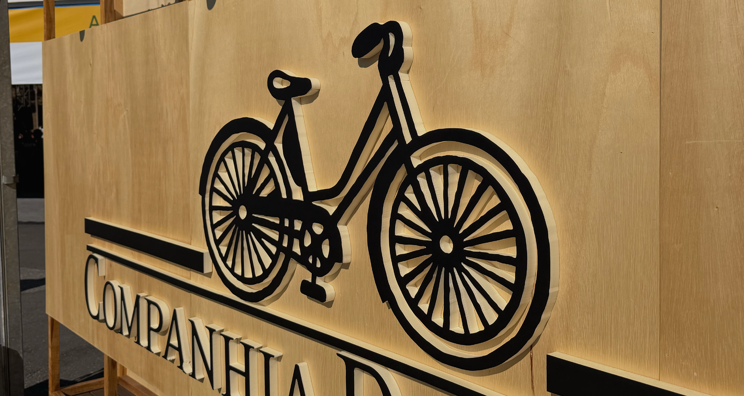
ÍCONES DA COMPANHIA DAS LETRAS
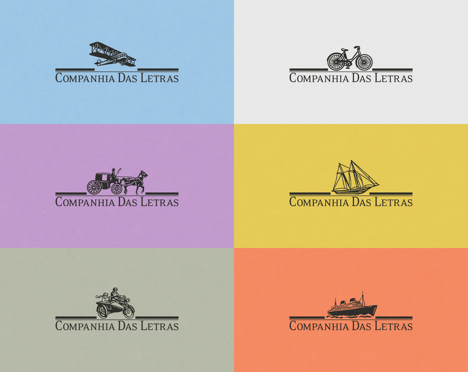
Em 1986, o designer João Baptista da Costa Aguiar criou a identidade visual da Companhia das Letras a partir de antigos clichês tipográficos encontrados em catálogos pertencentes ao artista Carlos Matuck. Com essas referências, desenvolveu um sistema de marca mutável e inovador, no qual diferentes meios de transporte podiam acompanhar o nome da editora, criando uma identidade múltipla e reconhecível.
Com o passar dos anos e as sucessivas digitalizações, os desenhos perderam algumas de suas características e passaram a apresentar inconsistências de traço, proporção e perspectiva. Embora funcionassem nas pequenas dimensões das capas dos livros, essas limitações se tornavam mais evidentes quando a marca era ampliada para estandes, feiras e outros materiais. Surgiu, assim, a necessidade de redesenhar os oito ícones para que fossem mais harmoniosos, legíveis e adaptáveis a diferentes formatos e escalas.
In 1986, designer João Baptista da Costa Aguiar created the visual identity for Companhia das Letras, drawing inspiration from antique typographic clichés found in specimen books belonging to artist Carlos Matuck. Based on these references, he developed an innovative, flexible identity system in which different modes of transportation could accompany the publisher's name, creating a visual language that was both dynamic and instantly recognizable.
Over the years, however, successive rounds of digitization caused the illustrations to lose some of their original qualities, resulting in inconsistencies in line weight, proportion, and perspective. While these imperfections were barely noticeable at the small scale of book covers, they became increasingly evident when the identity was reproduced at larger sizes, such as on exhibition stands, book fairs, and other branded materials. This led to the redesign of the eight icons, making them more cohesive, legible, and adaptable across a wide range of formats and scales.
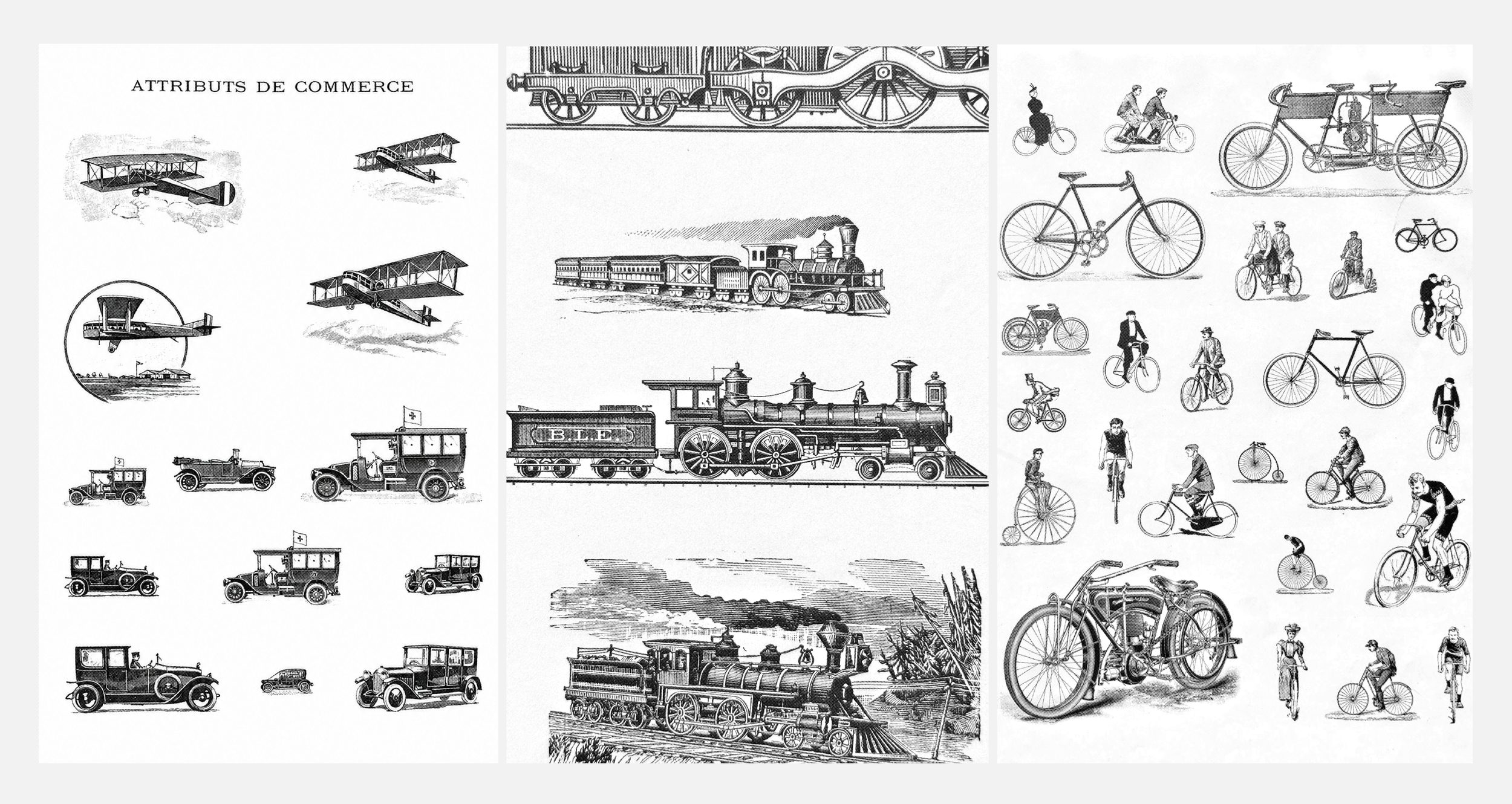
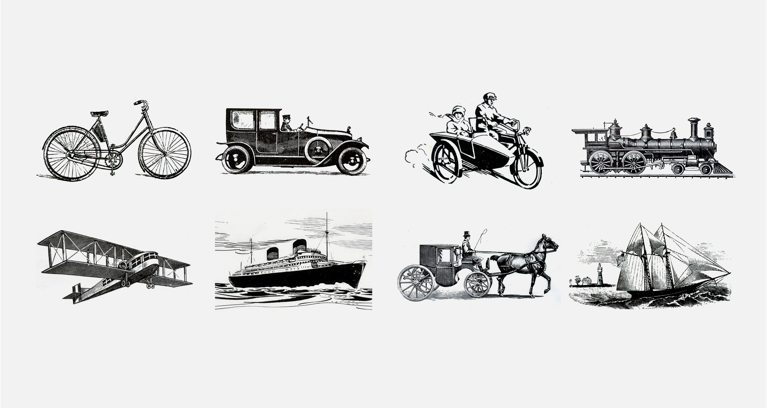
As primeiras propostas foram desenvolvidas diretamente sobre os ícones existentes, pois os clichês que haviam inspirado João Baptista não estavam disponíveis. Percebendo, porém, que esse caminho poderia afastar os novos desenhos da essência da marca, procuramos Carlos Matuck diretamente e iniciamos uma pesquisa para localizar os antigos catálogos e identificar os cliparts utilizados na criação original.
A descoberta dessas imagens transformou o projeto. Em vez de redesenhar a partir das interpretações de João Baptista, retornamos às mesmas referências usadas pelo designer em 1986 e realizamos novos desenhos à mão sobre os cliparts originais. Esse resgate permitiu preservar a personalidade e as imperfeições características da marca, ao mesmo tempo que trouxe maior unidade, clareza e versatilidade aos ícones — preparados para funcionar tanto no tamanho reduzido de uma capa quanto em grandes ampliações.
The initial proposals were developed directly from the existing icons, as the original typographic clichés that had inspired João Baptista were not available. Realizing that this approach risked drifting away from the essence of the identity, we reached out directly to Carlos Matuck and began researching the original specimen books in order to identify the cliparts used in the original project.
The discovery of these images transformed the work. Rather than redrawing João Baptista’s interpretations, we returned to the very same references he had used in 1986, creating new hand-drawn illustrations based on the original clip art. This approach preserved the distinctive character and subtle imperfections that define the identity, while bringing greater consistency, clarity, and versatility to the icon set—allowing it to perform equally well at the small scale of a book cover and in large-format applications.
“O Foresti foi — e aí eu achei uma jogada de mestre, foi incrível — lá para o início da Companhia. Conseguiu encontrar os cliparts que foram usados no primeiro logotipo e fez um redesenho em cima desses cliparts.”
Alceu Chierosin – Editor de Arte da Companhia das Letras
"Eduardo Foresti made a brilliant move, it was incredible—he went all the way back to the very beginning of Companhia das Letras. He managed to find the original clip arts used for the first logo and created a new set of drawings based directly on those images."
Alceu Chierosin – Art Director, Companhia das Letras
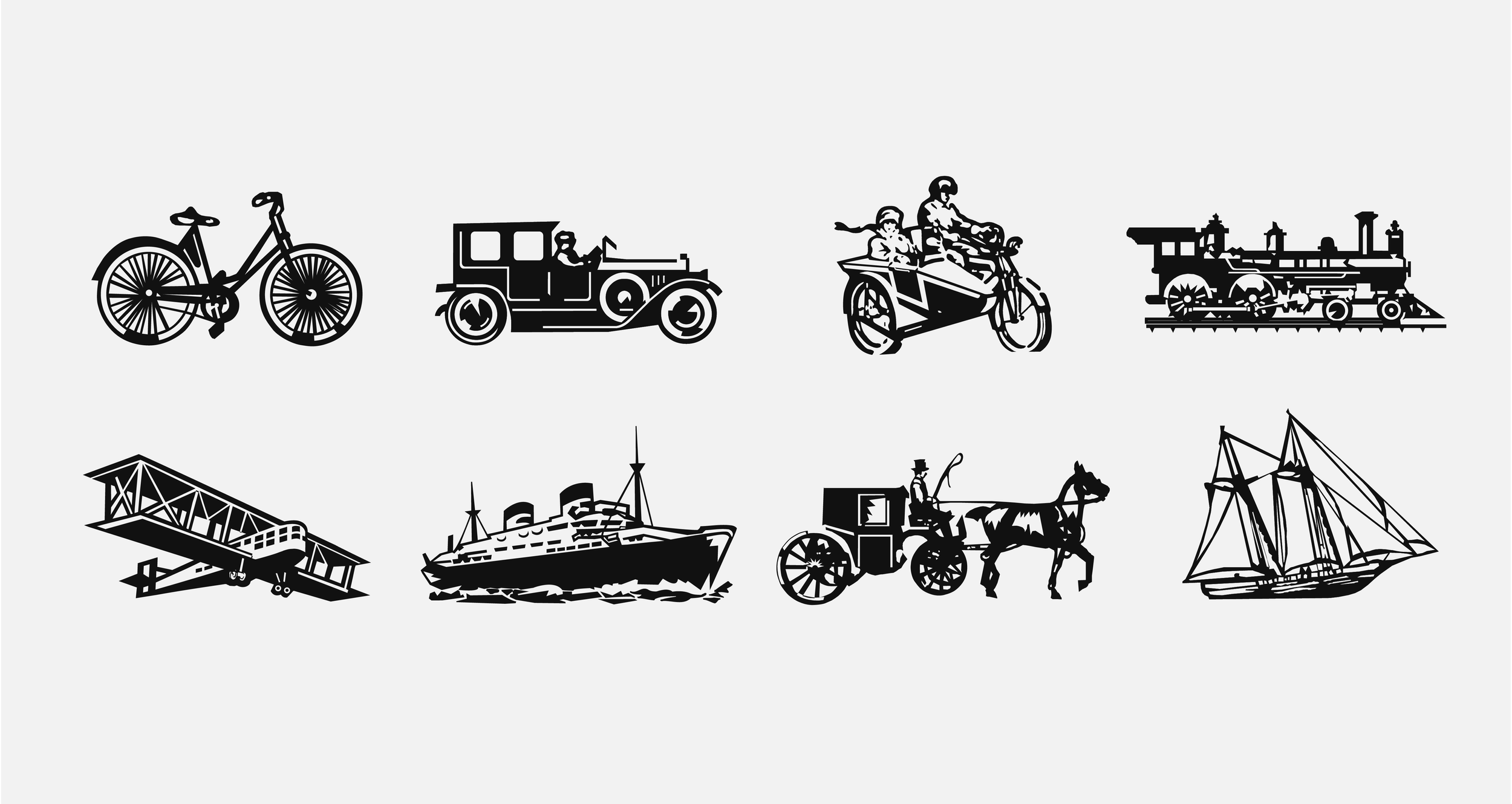
Os 8 ícones na interpretação de João Baptista da Costa Aguiar.
The eight icons as interpreted by João Baptista da Costa Aguiar.
Os cliparts originais, dos livros do Carlos Matuck
The original clip arts, from Carlos Matuck’s books
Novos ícones, redesenhados por Eduardo Foresti.