

1
2
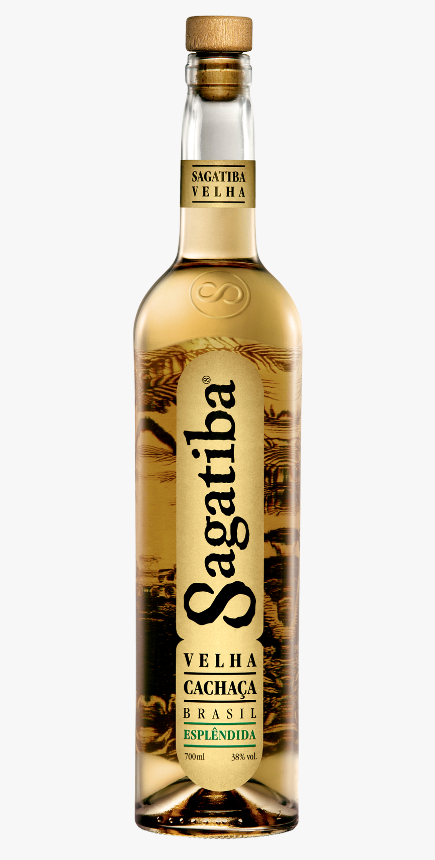
Em 2004 eu trabalhava na F/Nazca e caiu na minha mesa o seguinte trabalho: criar a marca, a identidade, a garrafa e o rótulo de uma cachaça que ia ser lançada pelo empresário Marcos Moraes. A ideia era que ela se diferenciasse de tudo o que existia no mercado. Era a criação praticamente de uma nova categoria de bebida, uma cachaça que as pessoas não tivessem preconceito de beber e que concorresse diretamente com as vodkas. Lembro de ter visitado a Feira da Cachaça pra ver o que existia no mercado. Quase tudo tinha cara de coisa velha e artesanal. Olhando a garrafa de uma grappa imaginei que o frasco ficaria mais elegante se fosse reto. Depois pensei que se escrevesse na vertical a etiqueta poderia ser estreita e se pusesse um desenho impresso no verso do rótulo ele apareceria na frente em um efeito de lupa. As pequenas descobertas e insights foram se somando e no final apareceram essas duas garrafas, criadas do zero. Na época eles eram tão diferentes que causaram um certo espanto, mas a confirmação de que funcionaram veio com os anos. Hoje é possível encontrar inúmeras garrafas de cachaça com seus nomes escritos na vertical e com imagens impressas no verso dos contra rótulos. Mas a maior prova para mim de que a embalagem é um sucesso foi ver outro dia em um supermercado uma vodka famosa se valendo dessas mesmas soluções em sua garrafa.
Finalista no 19º London Festival
In 2004 I was working at F/Nazca Saatchi & Saatchi and the following challenge appeared at my table: to create the brand, the visual identity, the bottle and the label of a cachaça (brazilian rum) that was going to be launched by the businessman Marcos Moraes. The idea was that it had to be different from everything that was on the market. It was almost the creation of a new category of drinks, a cachaça that people would not be ashamed of drinking and that would compete directly with vodkas. I remember visiting the Cachaça Fair that happens every year and seeing that everything looked too old and handmade. When I saw the bottle of a grappa I thought that Sagatiba's flask would be more elegant if it was straighter and taller than the average cachaça bottle. Afterwards I thought that if I positioned the brand vertically the label could be narrow and that if a drawing was printed on the back label it would appear magnified in front. The small discoveries and insights kept coming and in the end of a long process we had these two bottles, designed from scratch. When they appeared they were so different that people were a little shocked, but the proof that they worked came with the passing of the years. Today it is possible to find numerous brands with their names positioned on the vertical and with images that have this magnifying glass effect. But the biggest proof for me was seeing some months ago at a supermarket that a famous vodka brand had copied these same solutions.